


Greetings everyone, and I hope your Sacred Time rites were successful during the holidays! I would just like to personally thank all of you – those who support us on Patreon and make this comic possible ,as well as those of you who just follow us every week. You guys are great!
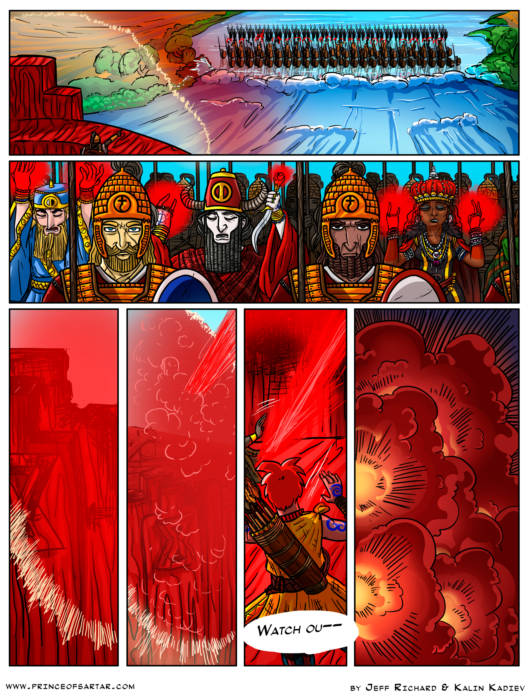
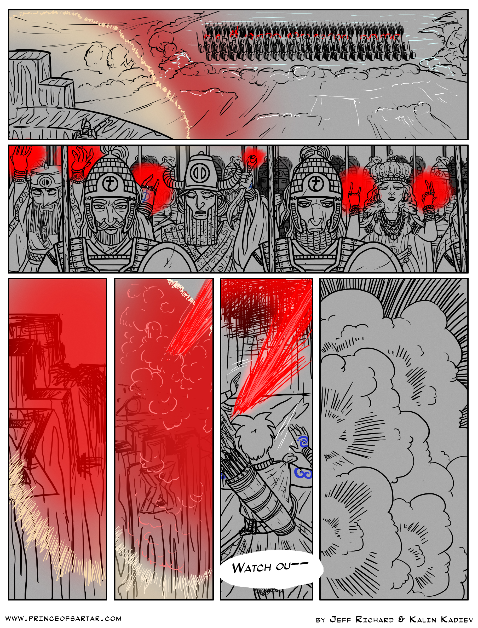
Now, as you can see the comic this week looks slightly…colorless. The reason for that is simple – our colorist simply didn’t have the time during the holidays, so I decided that instead of making you wait even longer, I’ll just post the page in this version, while we all await the colored one. Once that one is done, I’ll simply replace it here.
2016 was kind of rough for the comic, what with me having to pause it a few times just to catch up with life, other work and all kinds of stuff like that. But we’re still going, and that’s what’s important! I will, of course, try and not let stuff like this happen in 2017, but let’s be real here – I can’t actually promise anything, except that I will try my best.
Please don’t replace the above B&W (sorta) version with a colorized version; either post it separately or have a link from one to the other. Even though Captain Blood and Casablanca were fine movies in their colorized versions, the original uncolored version had their own artistic merit, and should be available as well, George Lucas notwithstanding.
Nah, I’ll do it the other way around. I’ll post the colored one here on the page, and upload this one somewhere else and link to it. This is a full-color comic, after all, so I don’t plan on changing that, unless there’s a good reason for it. (Say, a very specific effect I want to have)
An intended-to-be-colorless version would have handled the shading and textures differently. I think the Lunars are supposed to be drawn up across the ford blocking the cradle’s path, but I’m not certain that they’re not supposed to be on the bank either. The colorist’s the colorist’s work to make that unambiguous.
I’m, glad we got to see this though. Working on a grey base so that you can add white highlight lines in addition to the black lines at this stage is a cool technique.
The Lunars are actually standing on a sheet of magical ice. That won’t really show up like this, until the color is added. You are right, though, that if I was to draw this in black and white it would look differently, which is why I have no plans of actually leaving it like this.
As for the grey base, the reason I draw on grey or some other darker tone (though the comic is almost always entirely on grey) is 1. So I can use white to highlight different elements – especially useful for me when I sketch stuff, and 2. It doesn’t hurt my eyes like staring at a giant white screen for several hours on end does 😛
Related Pages
- 60 – The City of Thieves
- 61 – Collecting Debts
- 62 – Thinking Small
- 63 – In the Interest of Gods and Rivers
- 64 – Making Baby Giants
- 65 – Robcradle
- 66 – The Damn Point
- 67 – Gimpy’s is Hopping Tonight
- 68 – Recruiting
- 69 – Adventurers
- 70 – Oldtown Alleyways
- 71 – The Master of This House
- 72 – Both
- 73 – Certainties
- 74 – Knowledge
- 75 – Ruined Home
- 76 – An Idea
- 77 – The King of the Giants
- 78 – Last chance to reconsider
- 79 – The Cradle
- 80 – River Priests
- 81 – Boarding
- 82 – Down the river
- 83 – Under the Tarp
- 84 – A Sleeping Baby
- 85 – Marching Orders
- 86 – What Do You See
- 87 – Bullford
- 88 – The Cradle’s Defenses
- 89 – Shrieks of Pain
- 90 – Shrieks of Pain, part 2
- 91 – Waters rising
- 93 – The first assault
- 94 – The first assault, part 2
- End of Chapter 5
Page Last updated: 2026-10-29 11:10:33